
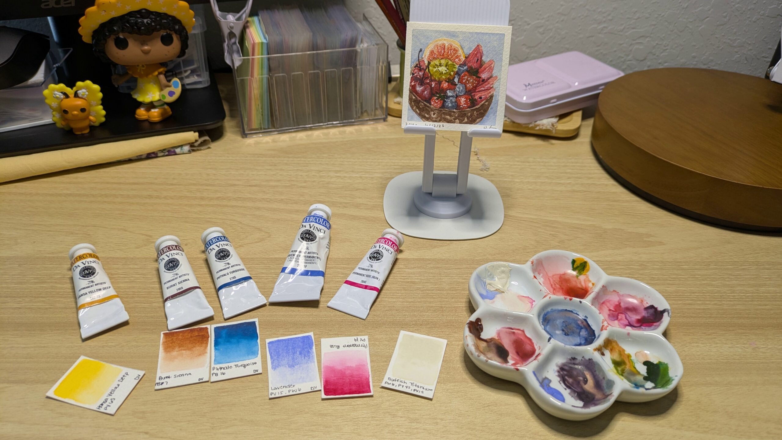
Summer is upon us, bringing with it stifling heat, the stench of other people’s sweaty bodies (I don’t sweat, I glisten) and stressful (yet memorable) family vacations. I personally have not been able to afford a vacation in a hot minute but that’s okay. You know why? Because I have watercolors to fill the void of relaxing on a beach somewhere, that’s why. And to show my gratitude to the little buggers, I’m here today to concoct a summer watercolor palette for you to use on your own vacation or at home (if, like me, you’ll be staying put this summer).
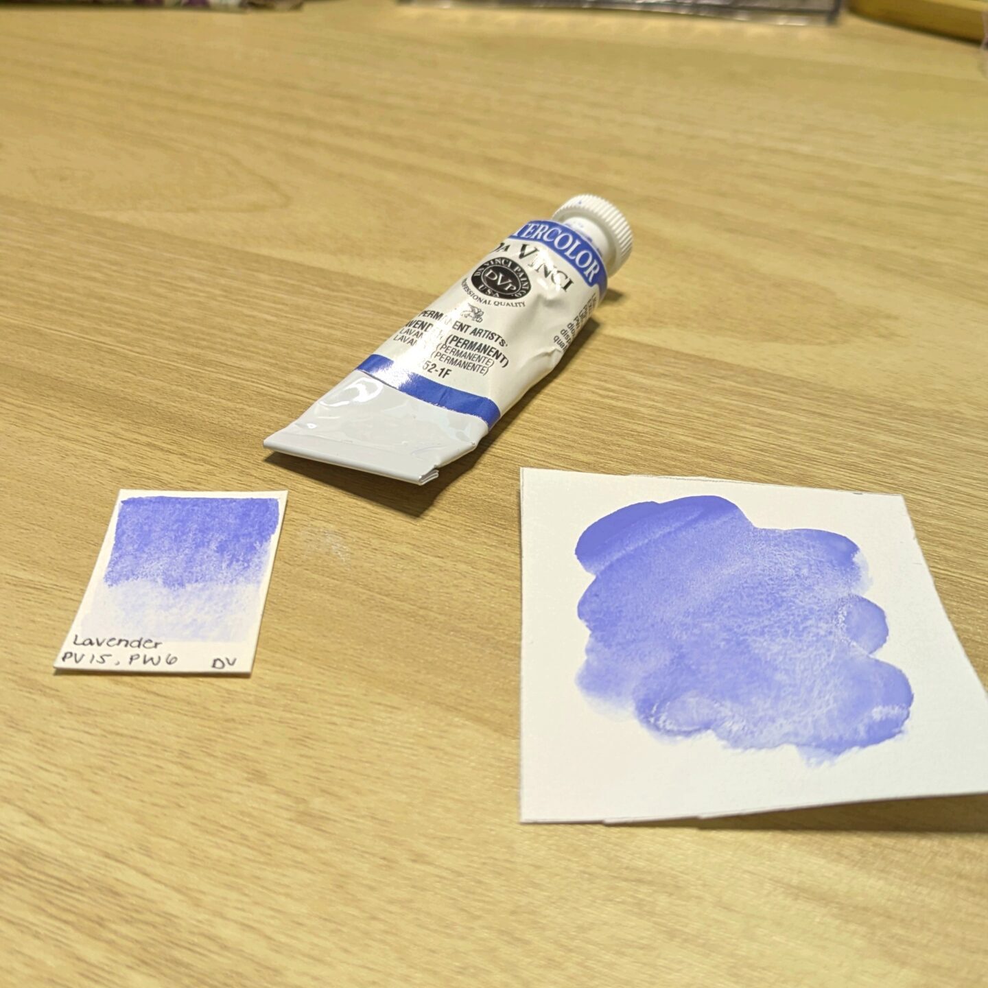
1. Lavender
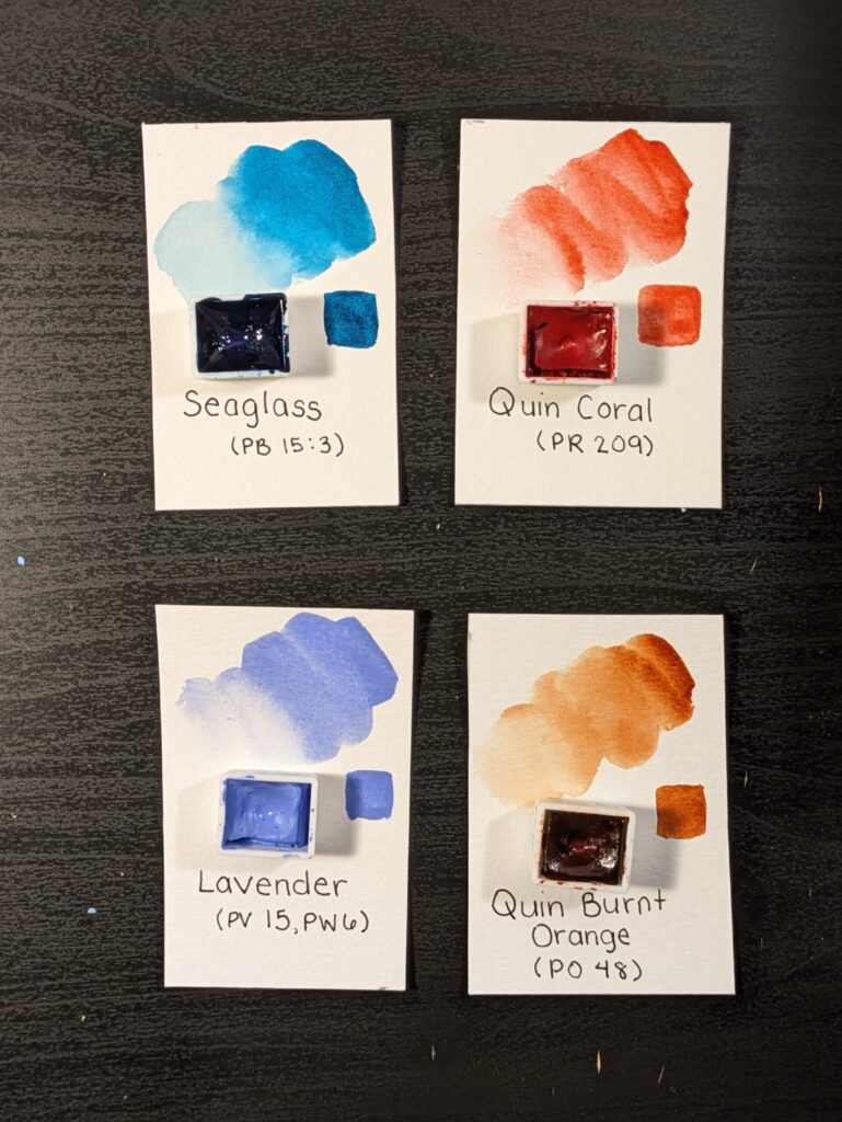
You can’t have a true Texas summer without what I call “periwinkle skies”. I know many fellow watercolorists like to use ultramarine blue or even phthalo blue to paint skies but I find the skies here in the big ol’ state of Texas to be warmer in hue. It’s one of the few things I like about living here. So, I petition that we add lavender to our palette to paint whimsical periwinkle skies as we dream about lovely summers from our past and better ones to come.
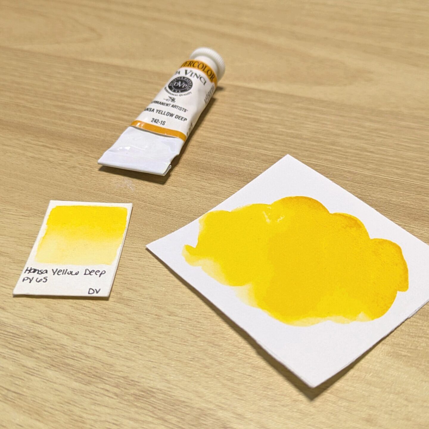
2. Hansa Yellow Deep
Next, we need a nice green to paint the greenery that should exist if it wasn’t so dang hot here in the southern USA. One of my biggest gripes about where I live in Texas is that there aren’t very many trees. But if I think back to summers in my hometown on the east coast, the trees were immaculate this time of year. They were no longer trying to kill me with their poisonous yellow dust and their branches were full and luscious.
Now we could add a regular old green to our palette, but I suggest that we add a yellow and a blue so that we can mix greens ourselves (we’re not lazy after all). For a yellow I suggest hansa yellow deep. Just like the summer sky, its screams sunshine and is perfect to use on its own as well.
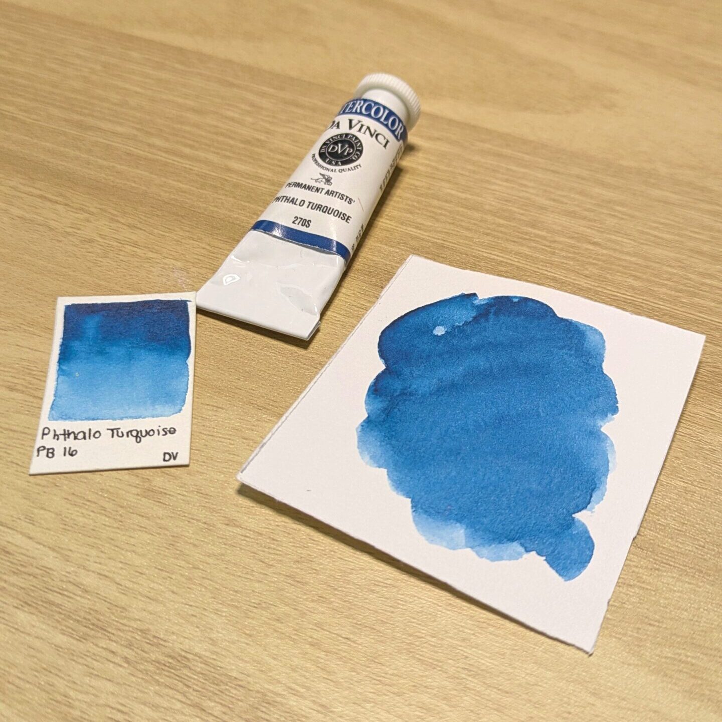
3. Phthalo Turquoise
Choosing a blue is extremely more difficult to do as there are so many good options. When picking the one that I ultimately chose, I kept in mind that in conjunction with mixing greens, we need a blue that can be used to paint water. As I mentioned, I grew up on the east coast and I lived very close to the beach. Now, we all know the Atlantic Ocean is kind of ugly in color but with a bit of imagination, we can pretend that phthalo turquoise is the right color to paint it. Anyways, I chose phthalo turquoise over phthalo blue because it leans towards green some which makes it perfect for both aforementioned tasks.
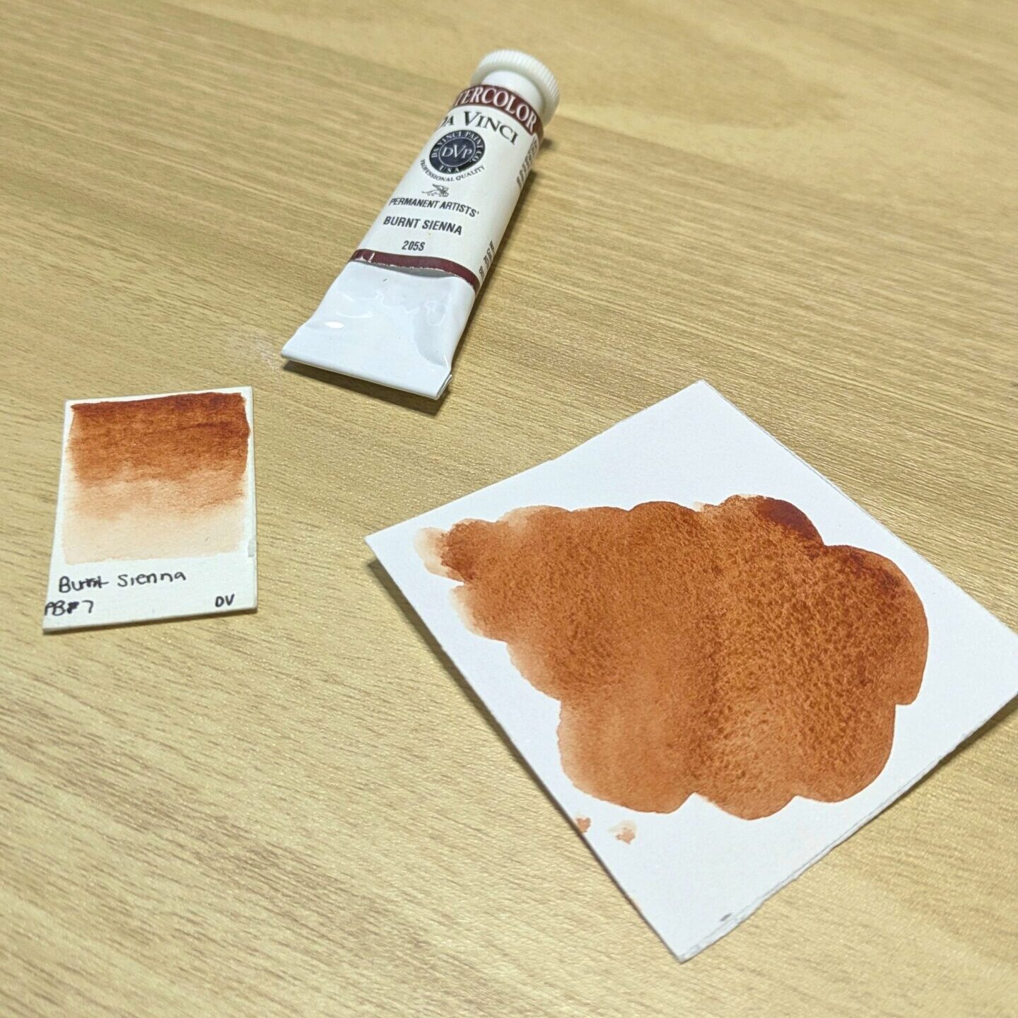
4. Burnt Sienna
If we’re going to be painting tress, then we obviously need some sort of brown for the trunks. I’ve got just the guy for the job. Burnt sienna is a perfect addition to our palette for many reasons. Its rich, almost decadent (it always reminds me of chocolate) and vibrant enough to fit in with all the rest of our colors. If we had chosen something like raw umber, it would be easier for it to look dull in comparison to everything else in our future paintings. I’m no expert though so if this isn’t true you’ve been warned and you can’t sue me.
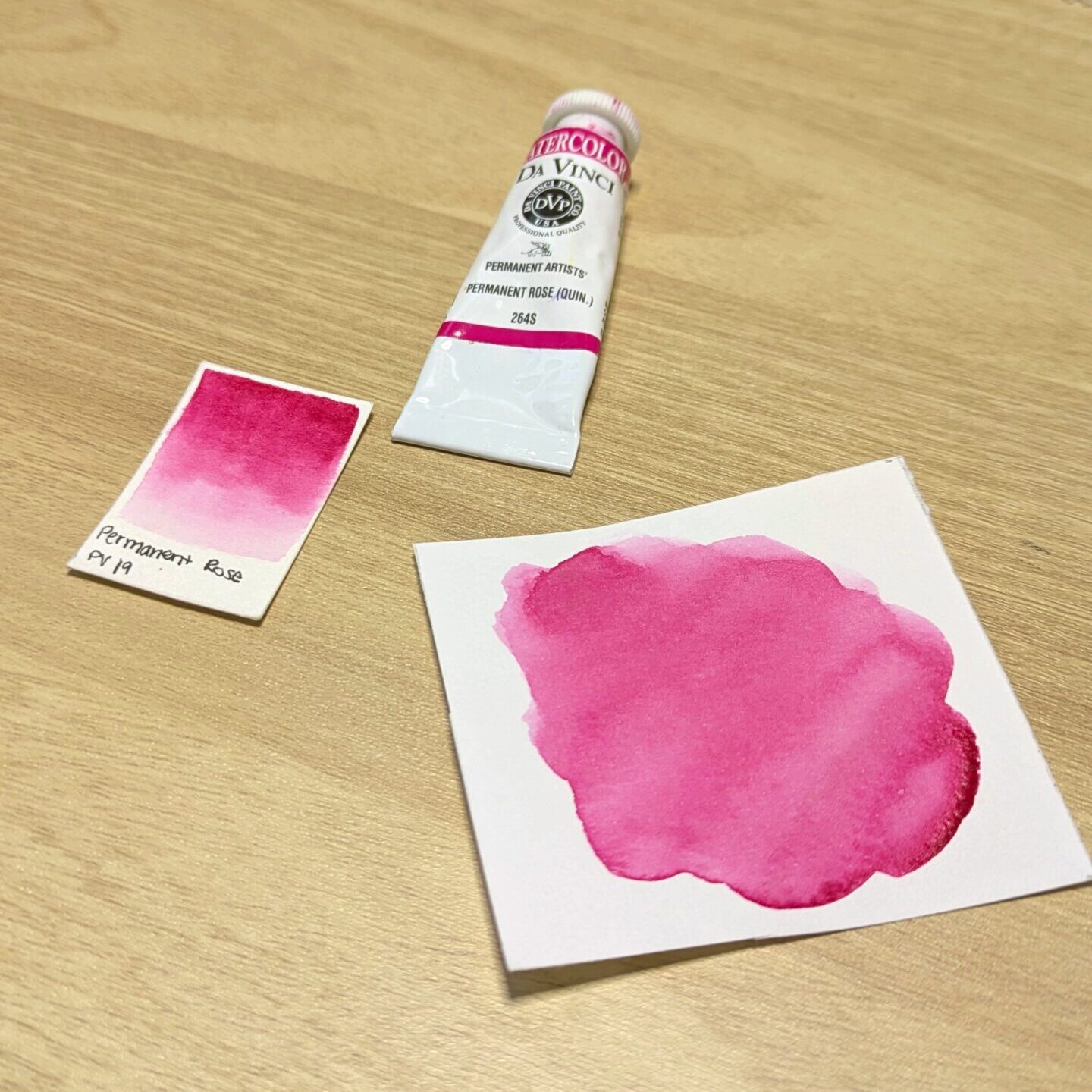
5. Permanent Rose Quinacridone
Until recently, I hadn’t really used this color much. I initially chose red rose deep quinacridone over it for my signature palette which I now know was a mistake. As they say, we learn from our mistakes. One day on a whim I decided to swatch it out and found that I liked permanent rose quinacridone better because it’s more vibrant and hence perfect for summer. One could use this color to paint anything from juicy delicious fruit to beautifully arranged florals. When mixed with phthalo turquoise, it makes stunning shades of purple and violet.
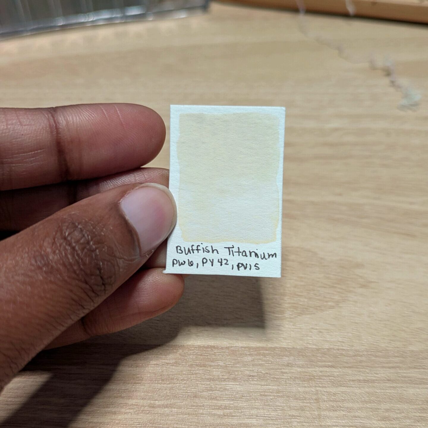
6. Buff(ish) Titanium
Okay so I don’t own a tube of Buff Titanium and to be honest, I’ve never even painted with it. But I’ve heard many an artist raving about how it’s the best color for painting sandy beaches and rocky cliffsides- both of which appear and summer vacation landscapes.
If you have this color in your arsenal, here’s your digital cookie: 🍪. If you’re like me however and don’t own this color, I did the hard work for all of us and researched (on the computer and with my own two hands) the best way to mix a similar color. I don’t know what buff titanium is supposed to look like in person so don’t get mad if it turns out not to be so accurate…
Let the fun begin!
So, whether you’re off on a summer adventure to somewhere tropical or chilling at home for the next couple of months, these colors should help you to express your summer sentiments on paper. Form stunning summer sunsets to luscious landscapes, this palette for sure has you covered (there’s some nice alliteration for ya). I definitely will be using this palette a bit more to see what I can get out of it.
If you want to see this limited palette in action, I have an accompanying video that you can watch on my YouTube channel. Let me know if these colors scream summer to you or if you would have chosen other colors. I’d also love to be tagged in any artwork you create using these colors so uh hit me up! With that being said, you never have to be the best, just try your best. And remember to create your own whimsy!

Watercolor Whimsy:
A Blog Dedicated to My Journey with and Love for Watercolor.
Blog categories
Featured

Leave a Reply