
Hot Takes
If it’s not apparent by how many times I’ve mentioned that I’m kinda broke; I’m a millennial. Although I’m pushing 30, I’m still down with new slang. One of such new slang terms the kids are throwing around is “hot take” (which I for sure did not have to look up when I first heard it…).
For those of you (*cough us) whose back reminds you how old you are each morning, a hot take is akin to a controversial opinion. Basically, something like chocolate is nasty, which I 100% agree with 95 percent of the time. Furthermore, the fact that 99% of people would disagree makes this a hot take. So, let’s get into some of my watercolor hot takes, shall we.
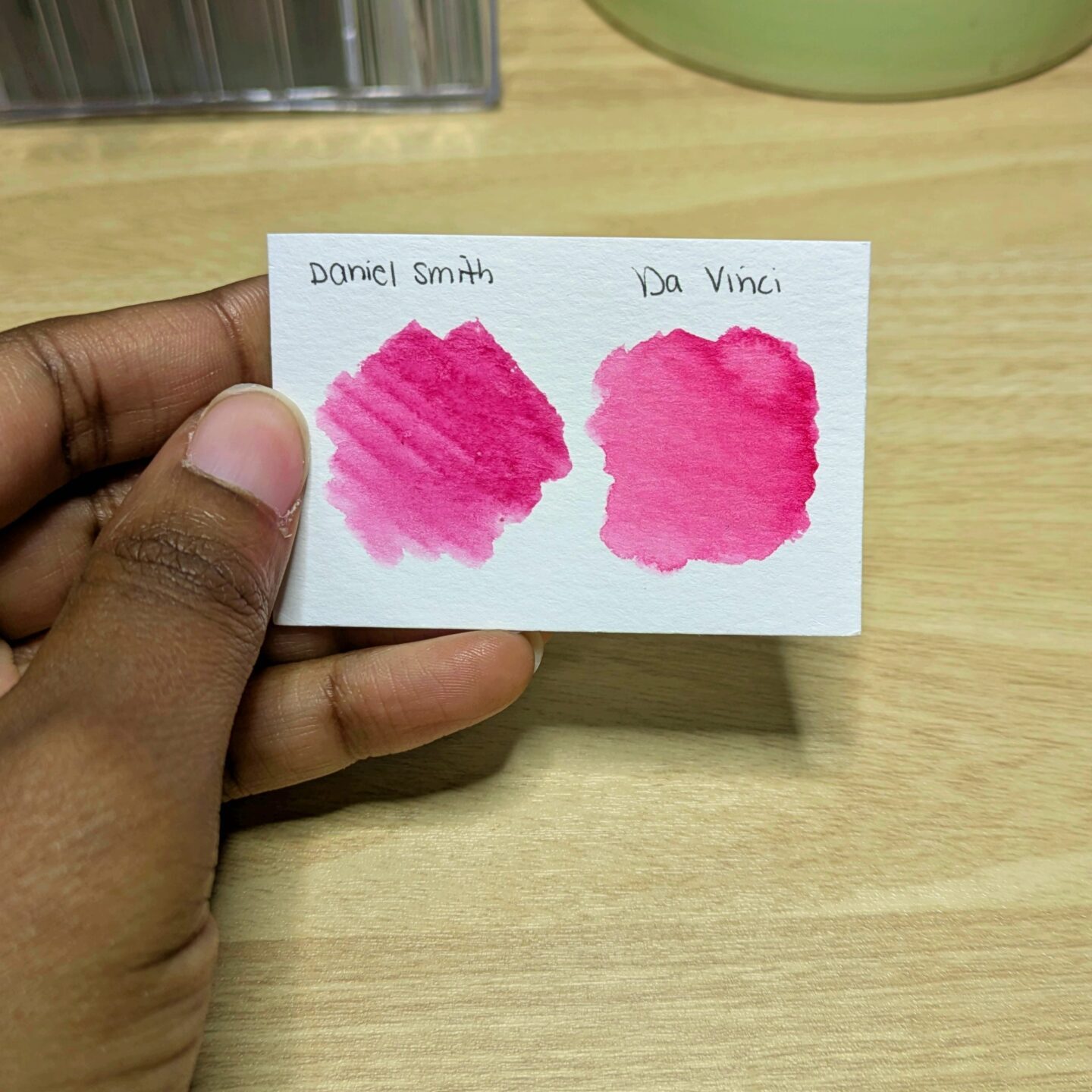
Hot Take #1: Daniel Smith
Ok (deep breath) I don’t think Daniel Smith is the best. There I said it. Now, before you try to slap me through the screen, let me plead my case. The defendant, aka Daniel Smith, was the second professional watercolor brand that I tried. I am for sure a creature of habit and once I like something, it’s hard for me to change even if I’ve only tried one brand per say.
Additionally, to contribute to the claims, I have never been able to get the same beautiful results from Daniel Smith watercolors as I’ve seen others do. However, I will say that I’ve noticed that those wonderful results seem to come from using watercolor paper that’s sized with gelatine like Arhches. I only use vegan friendly watercolor paper, so I think this is more of a “me” problem than a “them” problem. Case closed.
Hot Take #2: Ultramarine Blue
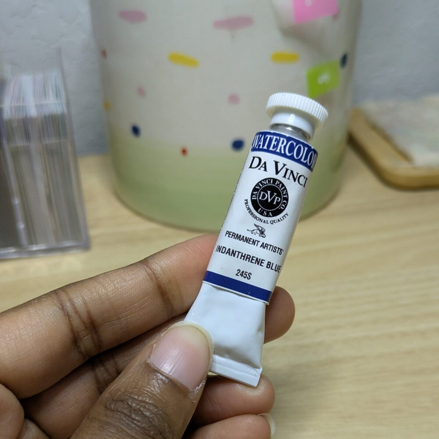
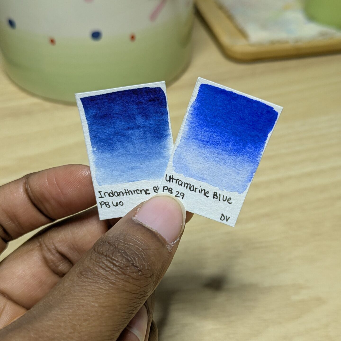
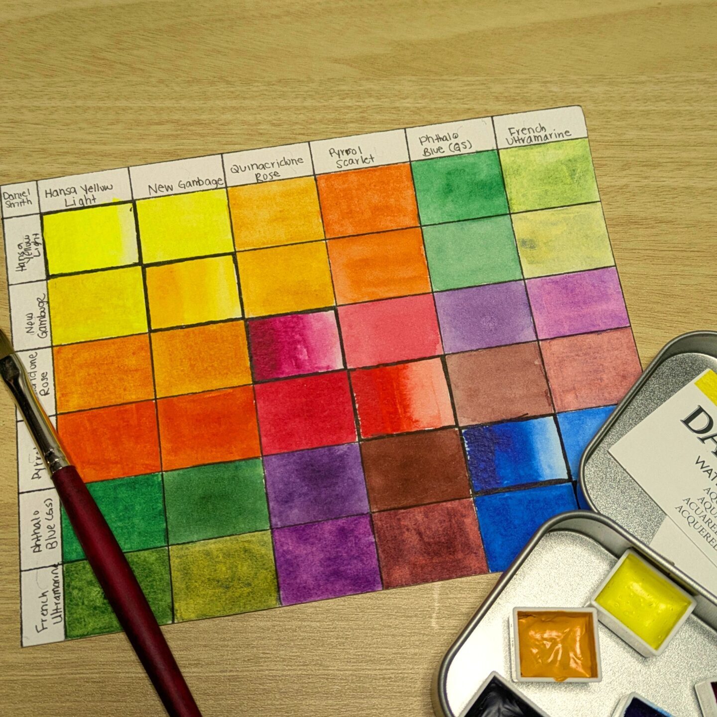
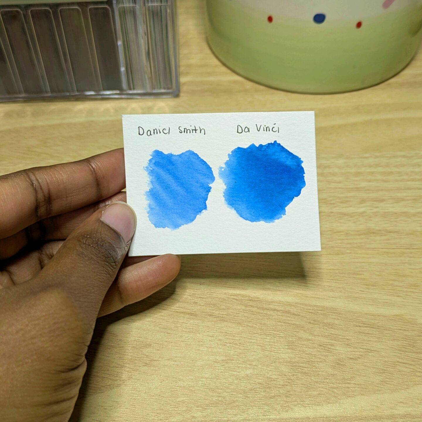
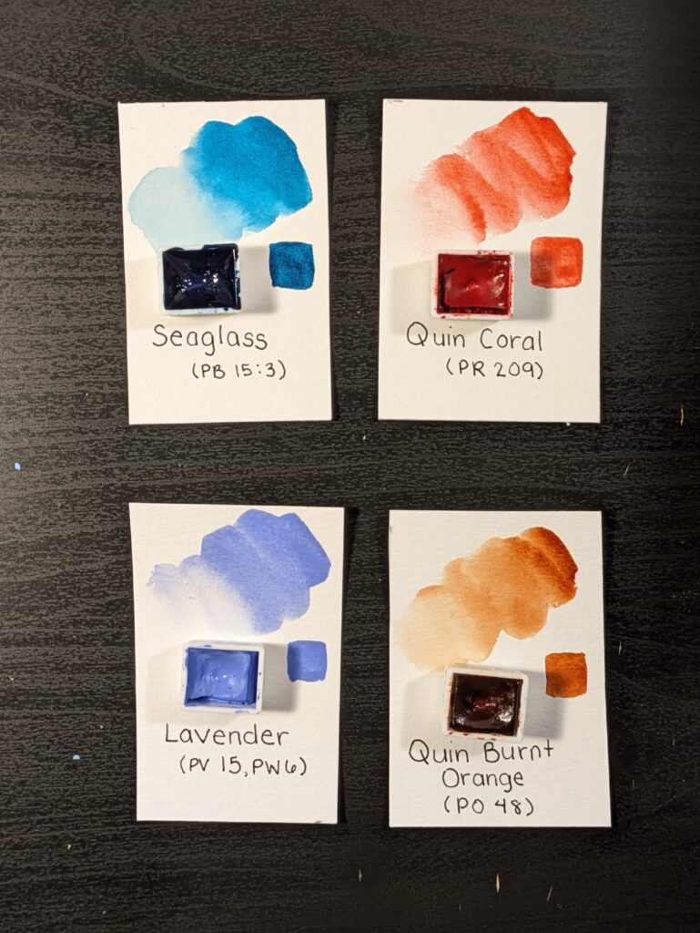
Now, if you aren’t already mad at me, you might be after this. I don’t like ultramarine blue. Call me shallow but it’s entirely because of how it looks. Conversely, I much prefer hunks like Phthalo Blue and Phthalo Turquoise. In fact, the warm blue that I include in my signature palette is the mysteriously moody cutie patootie known as Indanthone/ Indanthrene blue. Dark and handsome is much more my type, especially when compared to flashy and dare I say garish PB29. I don’t know why but ultramarine blue just reminds me of the ugly blue tempera paint we used in grade school. It’s ugly, no ifs ands or buts.
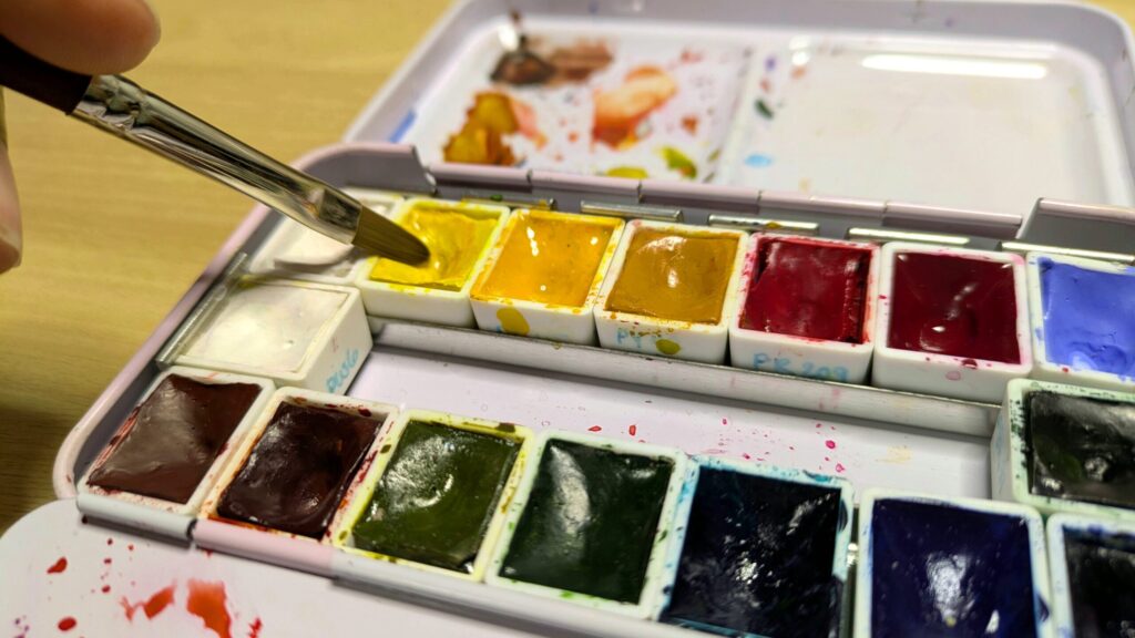
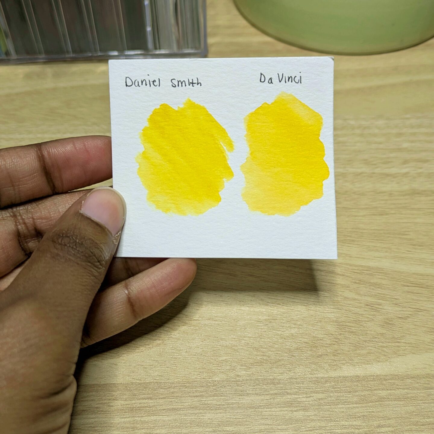
Hot Take #3: Dirty Yellows
My entire life I have been what most would consider a perfectionist. I like things to be neat and tidy. One time in middle school, the contents of my backpack fell out and one my classmates quipped “Your stuff even fell out neatly!” I attribute this to my method of packing things in from largest to smallest (in an attempt to not have one of those unsightly turtle back looking packs), but I digress.
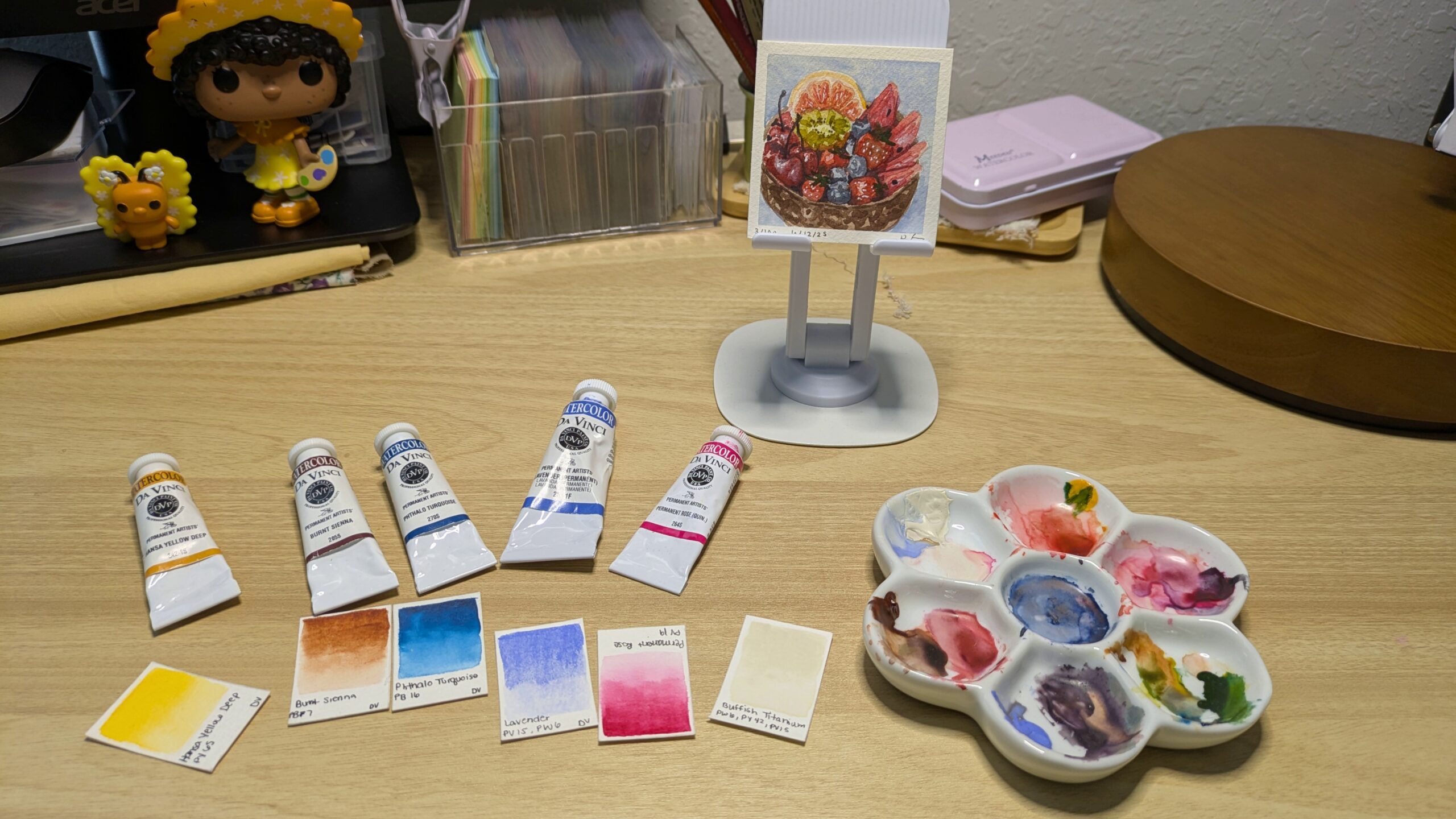
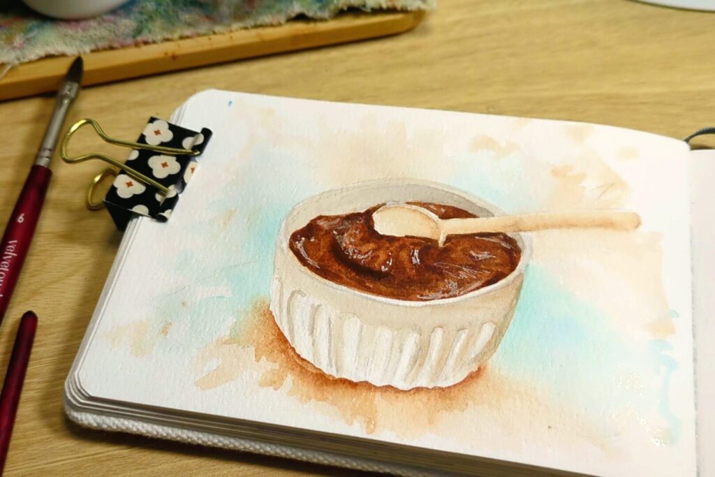
My watercolor palette is not exempt from my high standards. Because of this, my yellows are pretty much pristine. I tried to dip a bush in my arylide yellow once while there was some other color on it. Immediately, I cleaned the arylide yellow half pan until it was back to how I like it. I just couldn’t do it. My pajama drawer is all the chaos I need in my life right now thank you. However, if muddy yellows are your thing, then you do you boo, I’m not judging. It’s just not for me
Please Don’t Hate Me
If by some miracle you aren’t a fuming fireball after all that, then you should probably go into hiding along with myself. I will be laying low for a bit because there is no way there isn’t an angry mob of watercolorists waiting to catch me with my guard down. If you too have watercolor hot takes or agree with mine, let me know and we can both apply for witness protection together. With that being said, you never have to be the best, just try your best. And remember to create your own whimsy.

Watercolor Whimsy:
A Blog Dedicated to My Journey with and Love for Watercolor.
Blog categories
Featured
Leave a Reply